Overview
Cingo is pest prevention company, which has been protecting families from insects and wildlife since 1974. Cingo’s digital presence needed a full experience redesign due to changing technologies and their existing difficult customer journey. We conducted a heuristic evaluation along with a lengthy technical discussion with their team. We developed a user centric journey that educated the customer and aided their decision making (which improved conversions too).
- Information architecture had to be reorganized. Most important information wasn’t discoverable.
- Colors were not ADA compliant. Multiple typefaces were used throughout the product.
Challenges
- They were struggling with showcasing their website in a way that separated them from their competitors.
- Visuals were inconsistent and outdated.
- Information architecture had to be reorganized. Most important information wasn’t discoverable.
- Buttons and iconography were unclear and inconsistent.
- Colors were not ADA compliant. Multiple typefaces were used throughout the product.
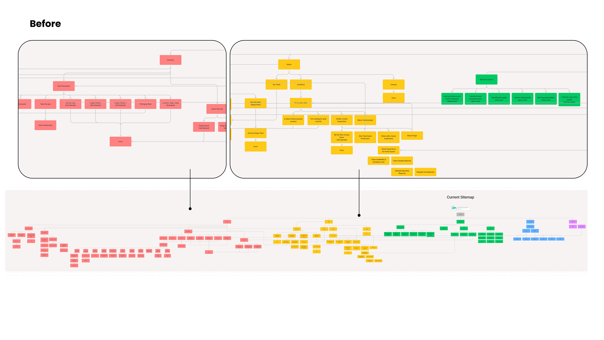
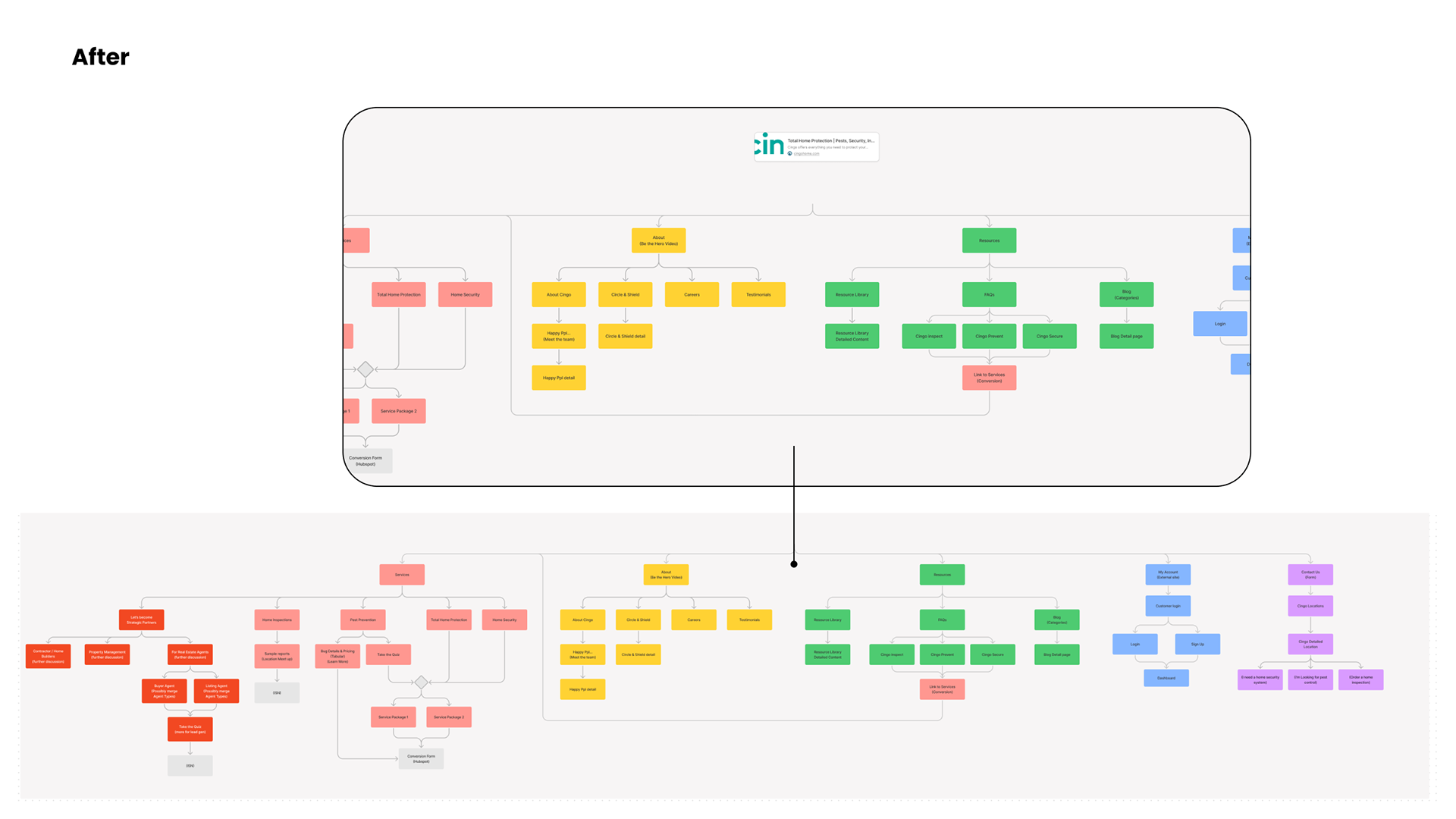
Product walk-though & Site maps
After having a walkthrough of the product by the Cingo team, our team created a site map to show the scattered interactions and identify a route for success. This map helped to guide conversations with stakeholders to identify interactions and pages to prioritize over others and restructure.
Through rounds of conversations, we were able to create a new site map that eliminated duplicate pages, entry points, and overall confusion. These maps also helped design and engineering align technical goals in order to achieve a seamless experience.
Wireframes
Based on the problems identified, we constructed detailed wireframes for content placeholders and layout exploration to improve the overall experience. Both wires and visuals were created using auto-layout in Figma to be easily responsive for both dev and the design team.
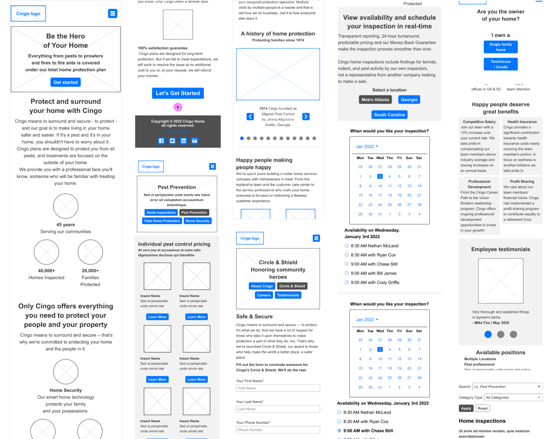
Problems with the current visuals
While stakeholders enjoyed the color palette, they agreed that the current visualizations were not aiding the experience. Rather, it created confusion.
- Users were unable to find what they were looking for and navigate to important areas within the site such as the Cingo Quiz.
- Color contrast did not meet the WCAG guidelines.
- Buttons did not use actionable language which made CTA’s unclear.
- Hierarchy was unclear due to the amount of visual elements and movement per page, resulting in areas that weren’t interacted with by Cingo users.
- Font styles were not established, resulting in a mixing of capital and lowercase letters, font sizes, improper and inconsistent line height, and multiple color styles.
Design library - components
We established early in the project that the easiest way to quickly transition from desktop to mobile layouts was to strategically create a design library.
This library increased productivity on all areas of the team. Pages and components could be easily changed after conversations with stakeholders, designers could reuse patterns to maintain consistency and avoid creating from scratch, and engineers were able to pull quick styles and components for easy implementation.
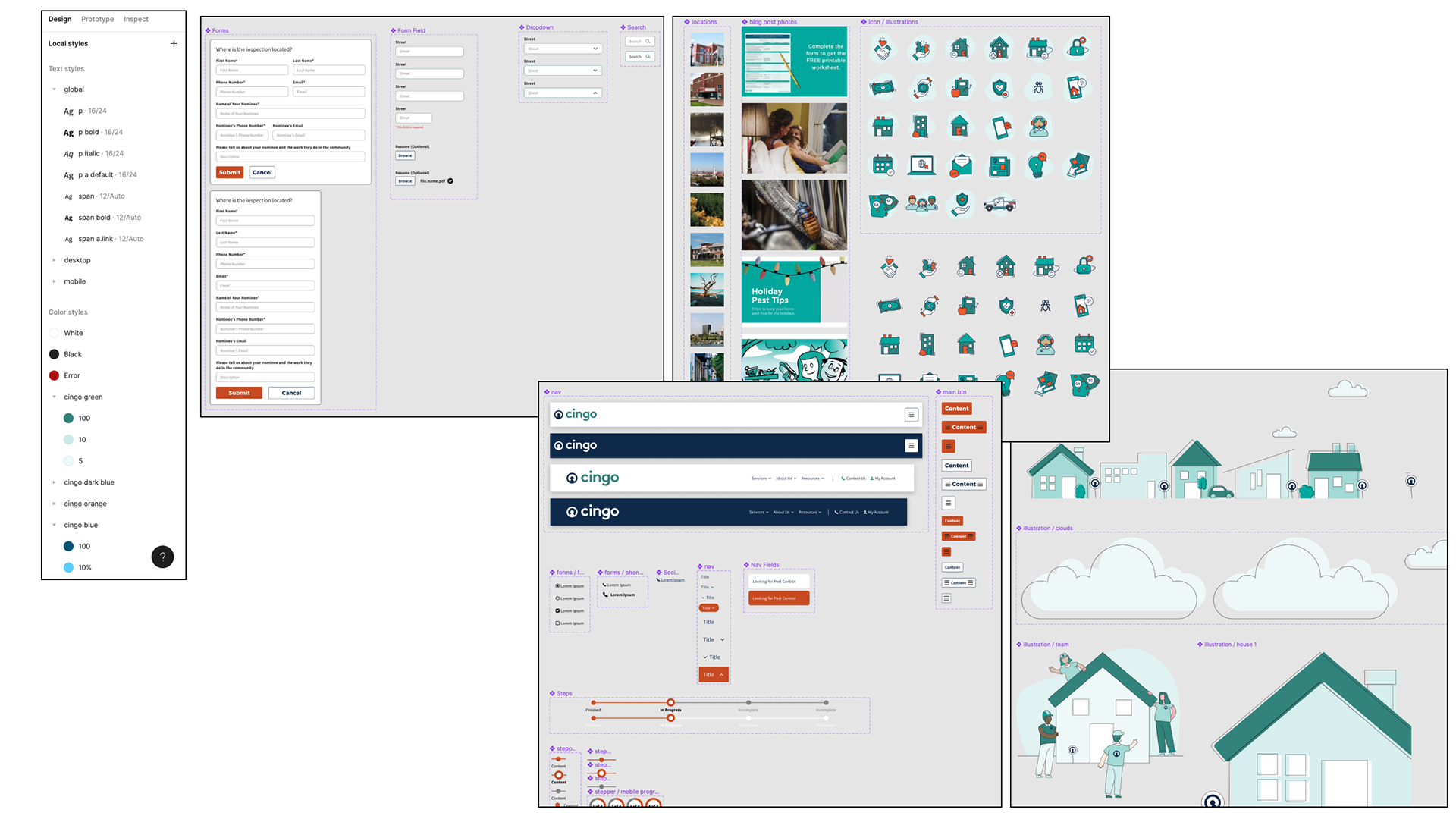
Design library - patterns
Reusable blocks or patterns were created using a mix of smaller components in the design library. This allowed designers and engineers to quickly create an entire page without constructing things from entirely from smaller elements which can be time consuming. The system as a whole was connected. If a change was made on a type style, that style would change throughout smaller components, to patterns, and then to final layouts. This maintained consistency and removed a lot of manual work.
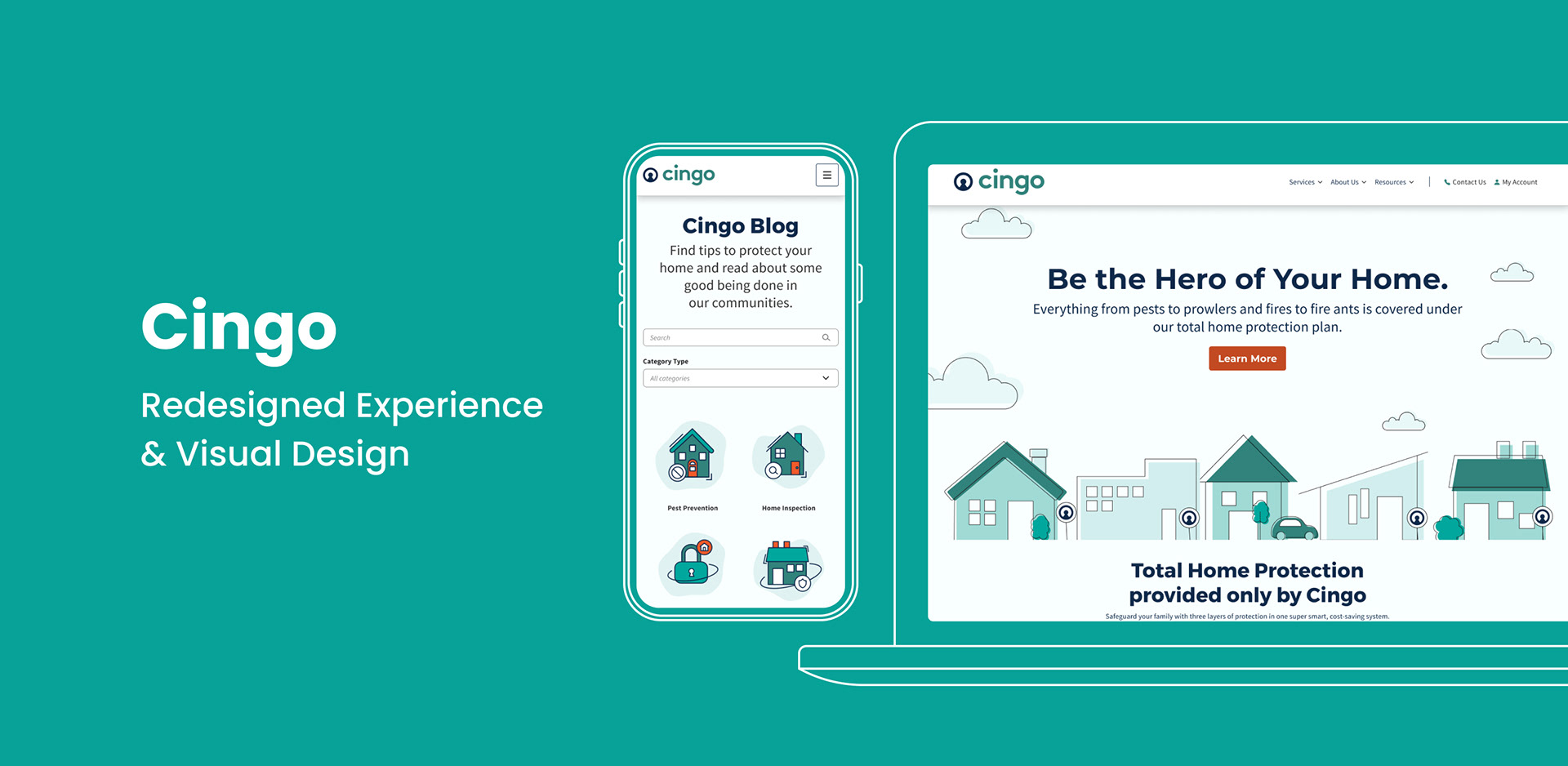
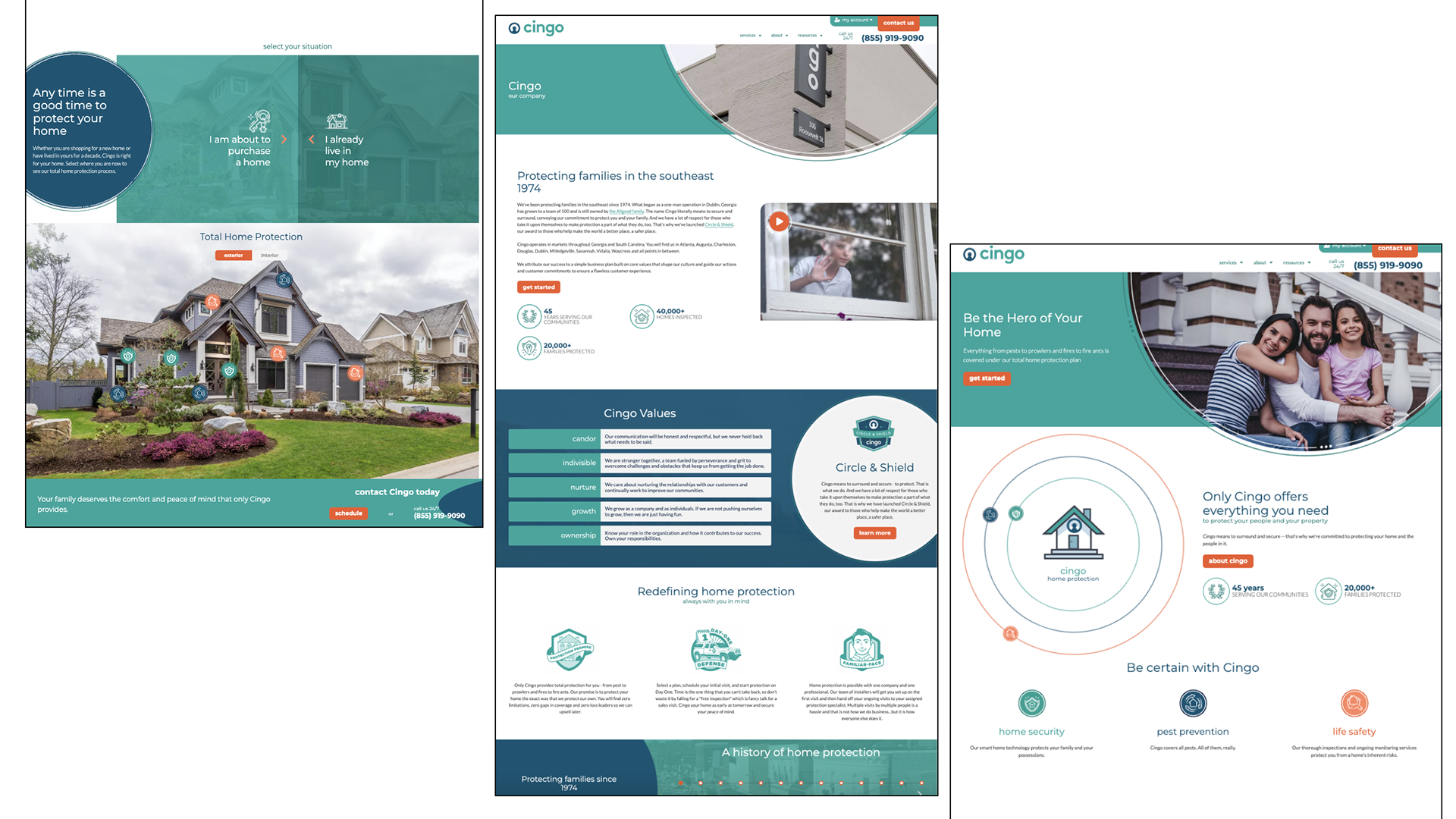
Visual design
The new visuals aligned with stakeholders’ vision for the company and product. The goal was to rework Cingo’s overall design to bring consistency that could be reused even after hand-off, as well as bring elements of design that made them friendly and approachable.
- All colors are now accessible, interactions
- Patterns have been established that avoid inconsistent design solutions, which has helped the team streamline their design process and inspire new designs.
- The new design was modern and aligned with their values.
- All colors are now accessible, interactions
- Patterns have been established that avoid inconsistent design solutions, which has helped the team streamline their design process and inspire new designs.
- The new design was modern and aligned with their values.
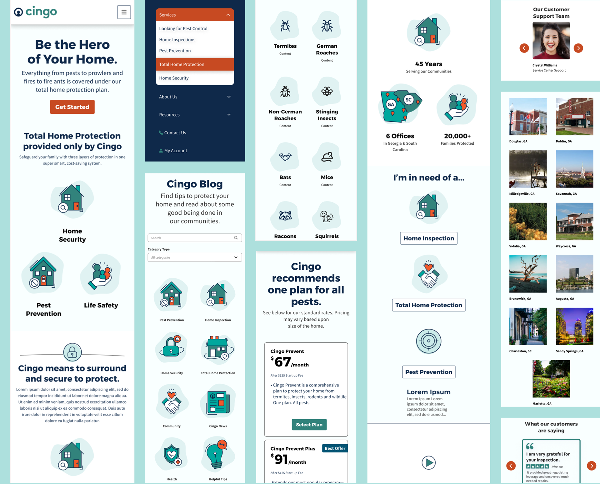
Desktop visuals
This data table allows the user to be able to view the revenue over various periods for the drugs that have been selected using various filters so that users can analyze the Drug Database.
While I did not work directly on this area of the dashboard, I collaborated and mentored designers on how best to navigate discussions with stakeholders and extract the answers we need from ambiguous requirements. I also supervised for quality assurance to ensure designs align with the design system in order to utilize patterns and avoid one-off components.
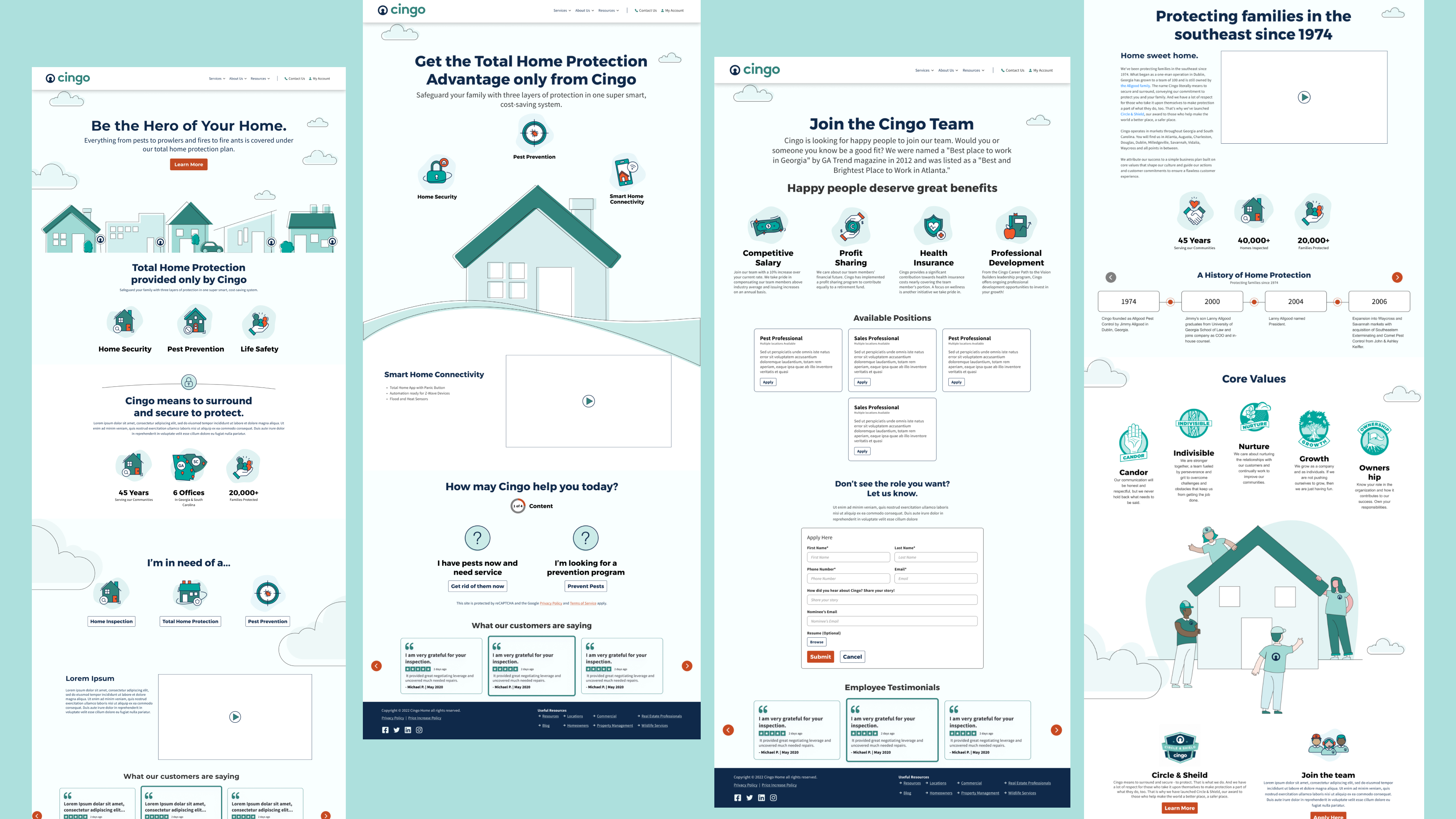
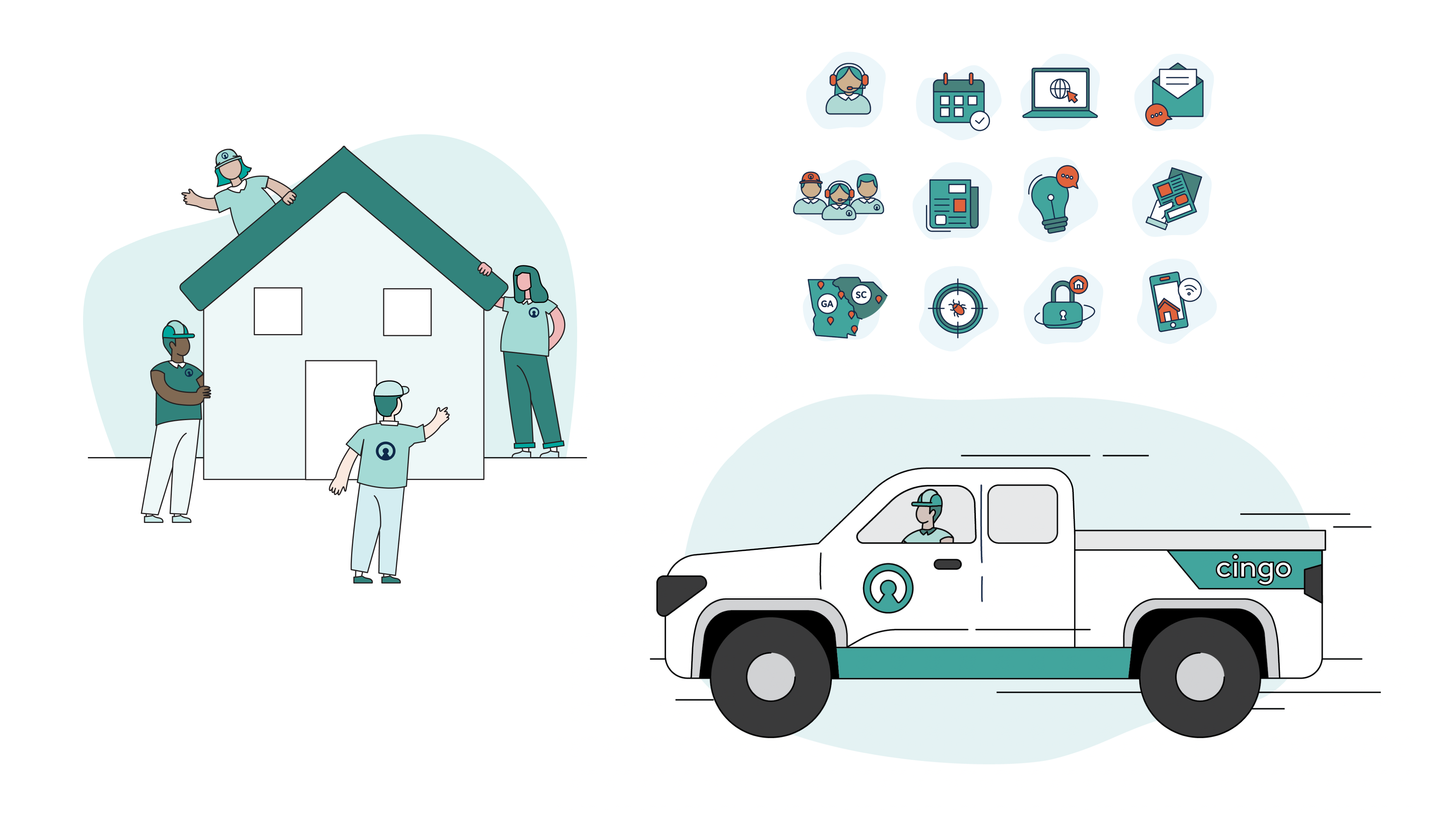
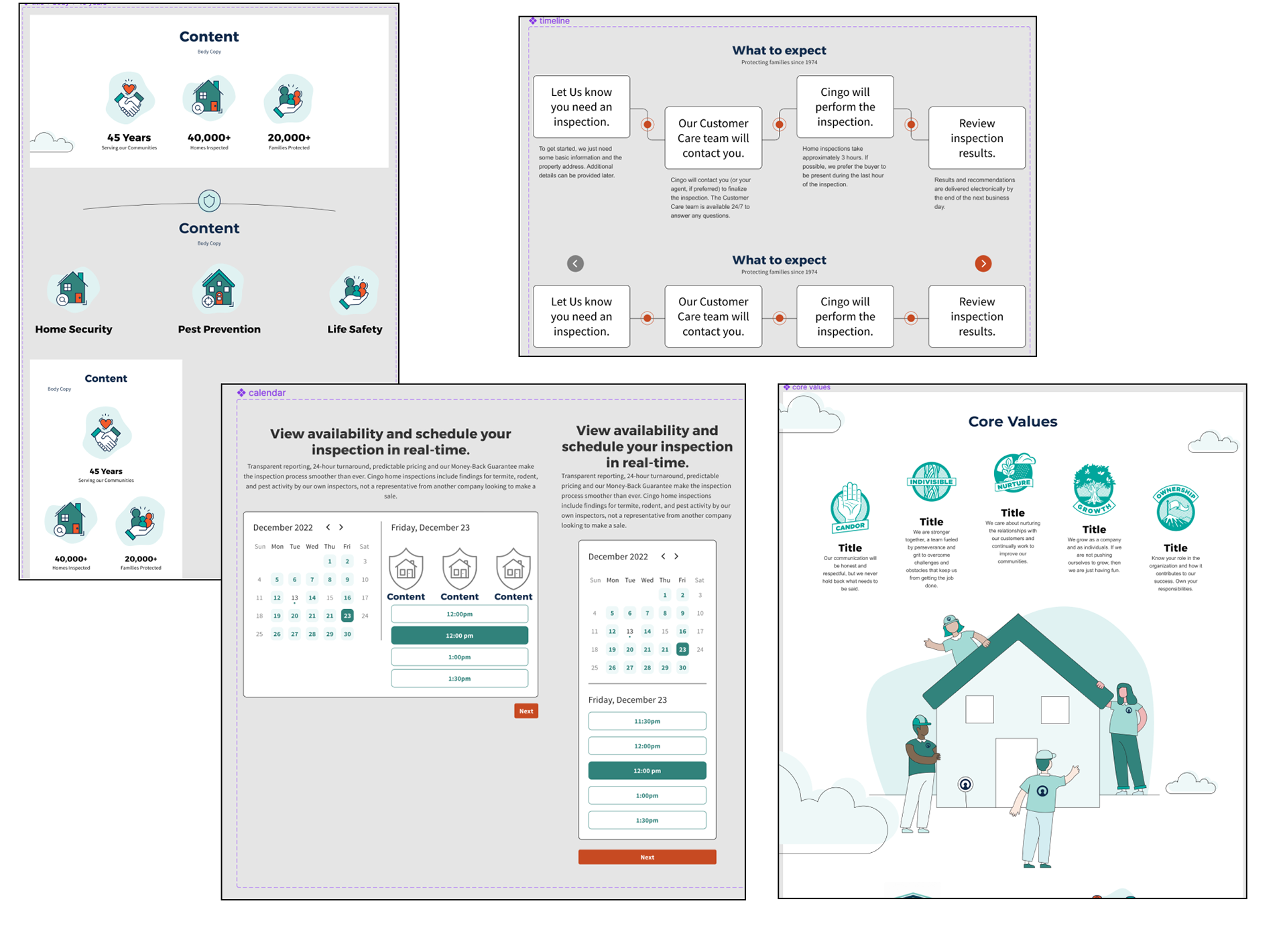
Custom graphics & illustrations
Custom graphics were created to be used on the site as well as marketing collateral. All artwork was created by myself using Adobe Illustrator and then brought into Figma to be used as components for the team.