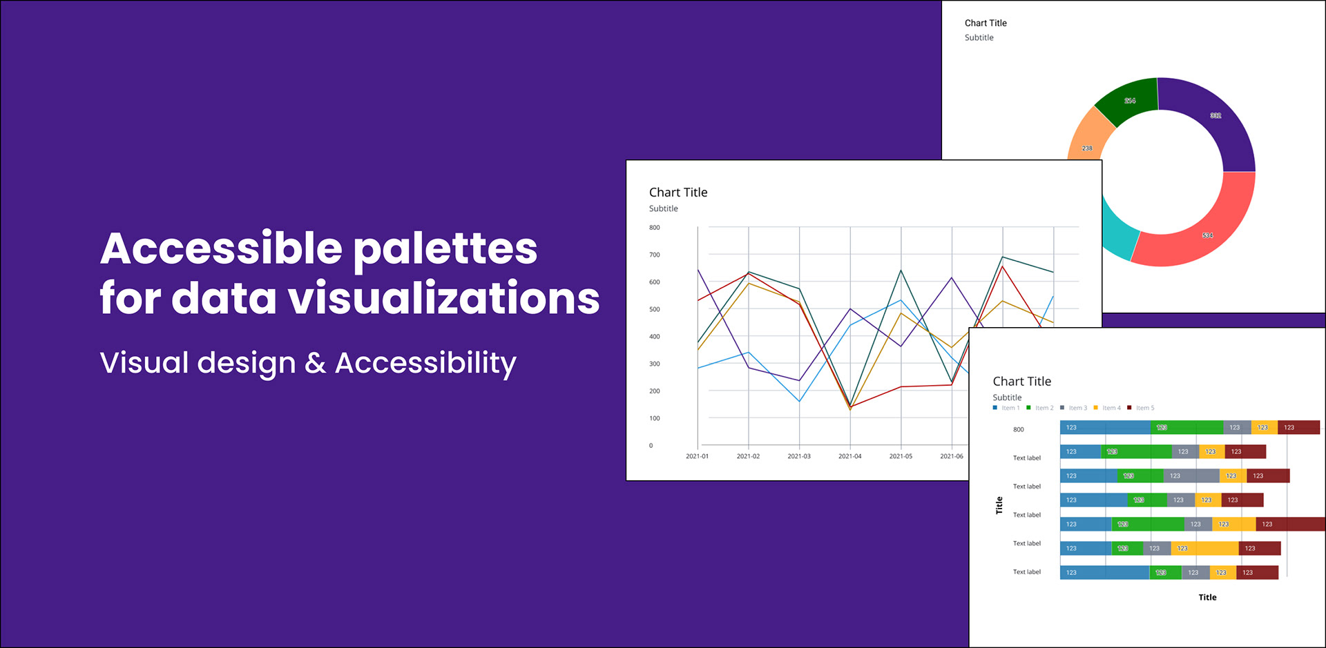
Overview
Visible Alpha lacked an accessible palette that can be used for charts and visualizations. The goal was to create an accessible categorical palette as well as quick combinations that designers can use within their designs.
Challenges
- The color swatches must be accessible not only between one another but on a white background to be considered AAA.
- Create esthetically pleasing visuals. Adobe’s spectrum and IBM’s Carbon all utilize vibrant colors (colors with a lot of luminance). Create a palette that incorporates these bright colors while also being accessible.
- Data visualization palettes can become complicated quickly. The palette should be simple to easily be digested and utilized by the company as a whole.
- Research say to remove emotional colors from your palette due to the association with an action. These are red, orange, yellow, green, and blue (success, warning, error, info). However Visible Alpha (and most of the trading world) uses red and green to represent high and low. These instances must be documented.
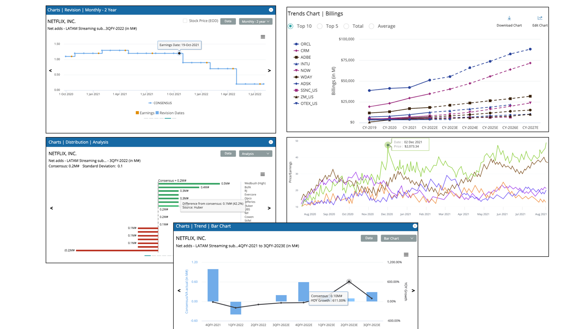
Current examples from the product
Color and shape are not following accessibility guidelines according to WCAG. Color contrast fails on most visuals, text overlaps onto other elements and is difficult to read and digest all data. Lines are thin and difficult to see. Text alternatives are not always provided with every chart. Inconsistencies with colors being used for similar charts with different meanings is confusing for users.
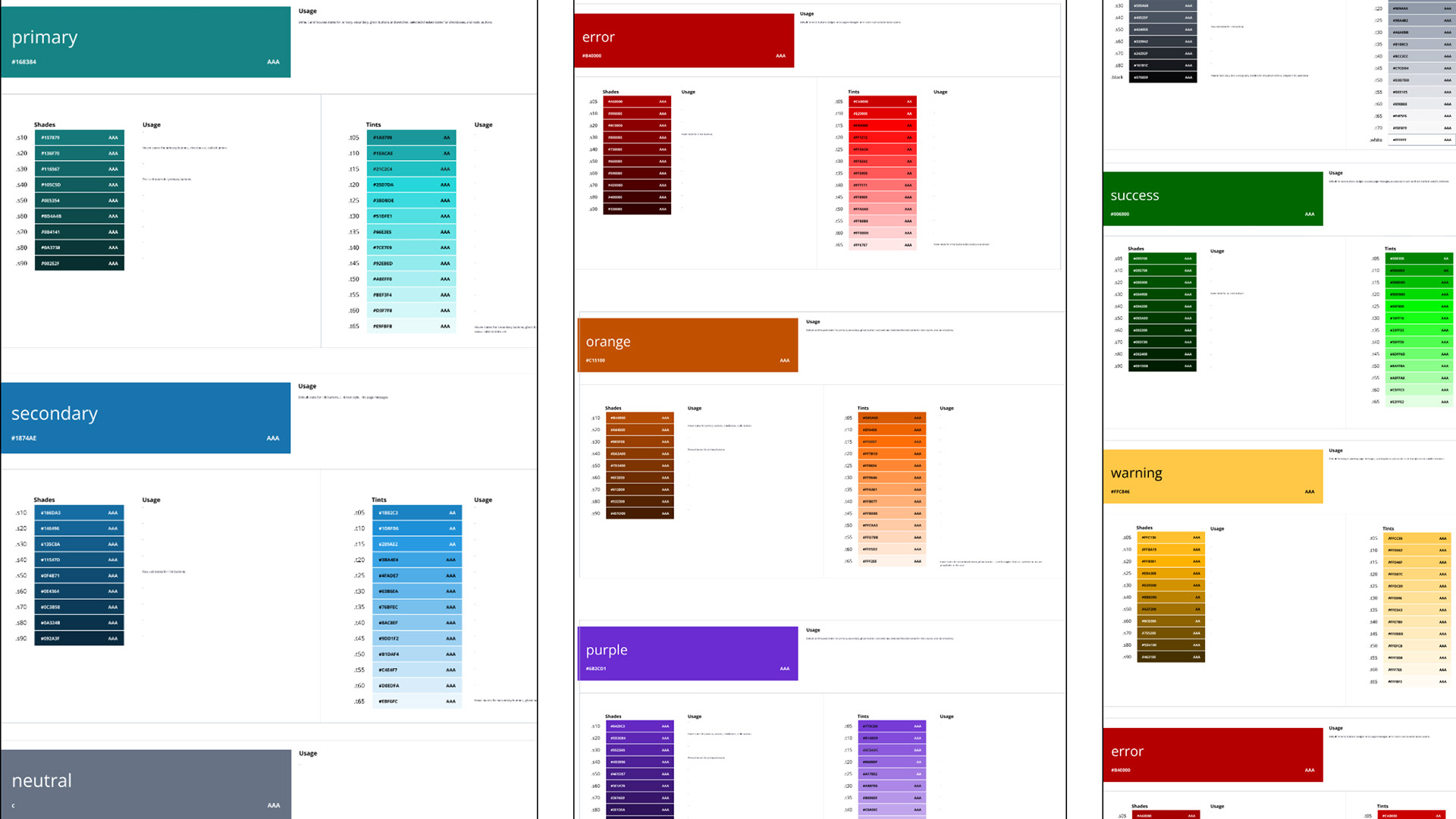
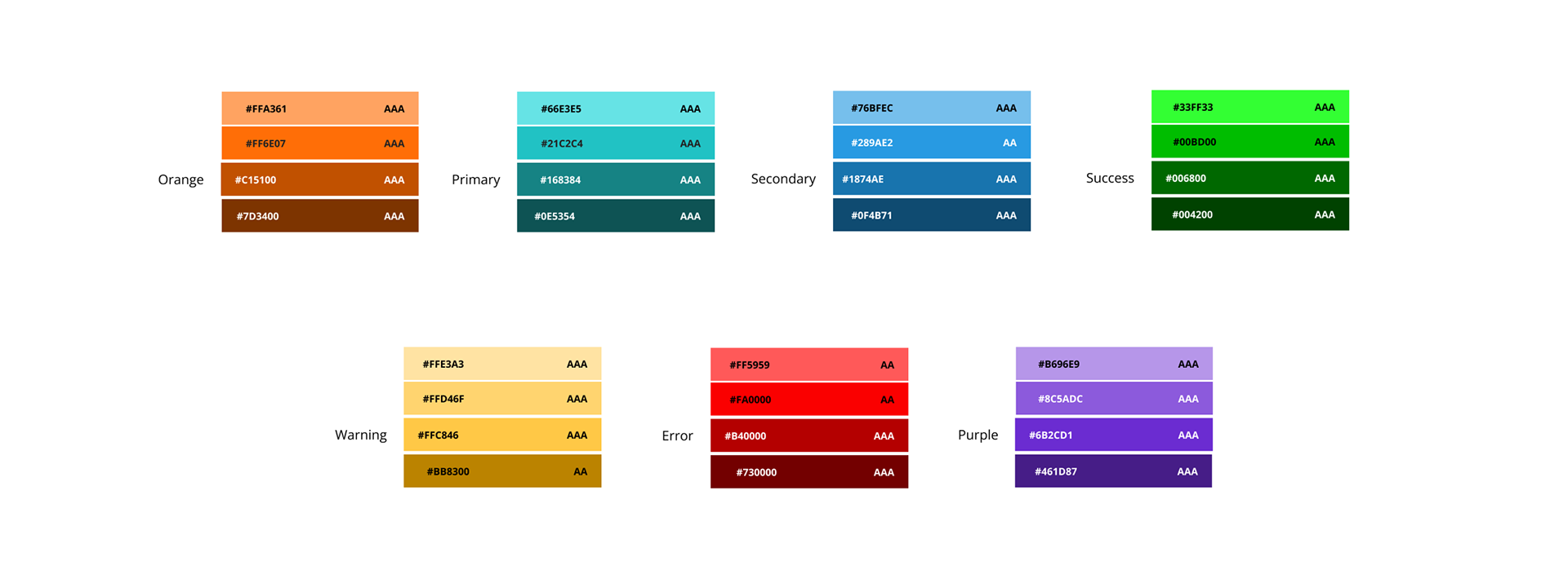
Simplifying
The number of shades and tints in our sequential palette was too extensive for visualizations and created confusion. Using IBM’s logic I’ve taken our shades and tints, and simplified the combinations down to those who have the most contrast. I’ve also added in both orange and purple to generate more options.
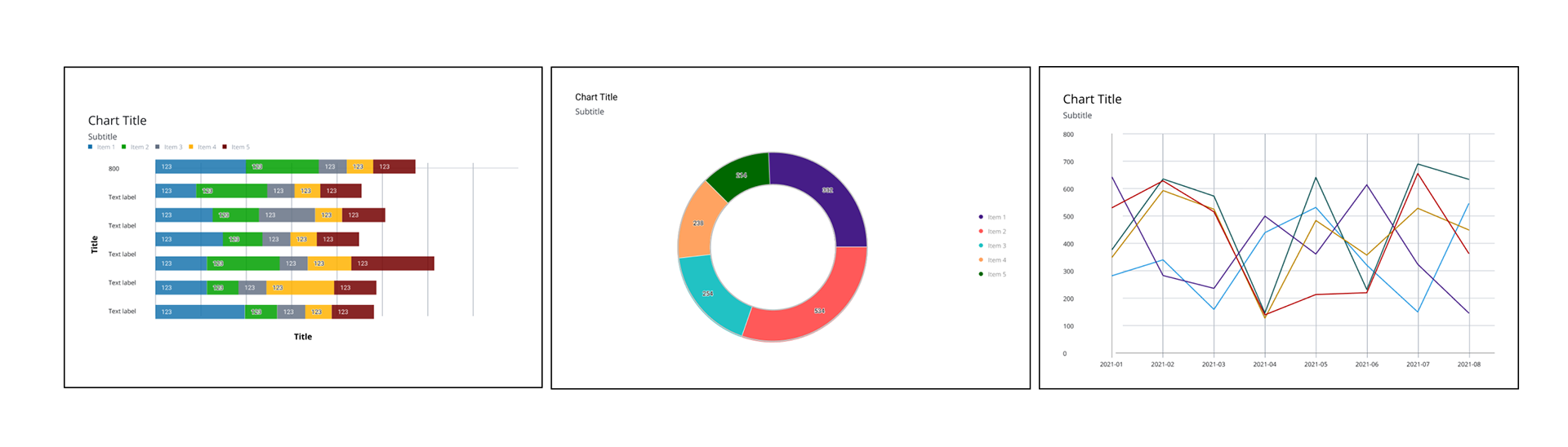
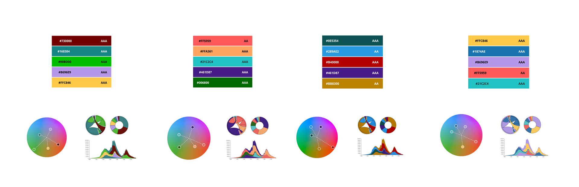
Quick combinations
Quick combinations were created for designers to easily take and implement into their projects. Each combination focuses on combining colors that fall on equal ends of the color spectrum in order to provide the most contrast. Each palette can be adapted for most charts with the use of shape in order to create accessible visuals.
Examples
These are a few examples of how the design team has reworked Ant charts to include accessible color palettes.